
We are excited to share the next chapter in Sentinel Credit Union’s story—a brand refresh that marks a significant milestone in our journey, including the unveiling of our new logo. This comes as we are about to celebrate our 70th anniversary in 2025, a testament to our longstanding commitment to serving our members and community.
Why a Brand Refresh?
In today’s rapidly changing financial landscape, it’s essential to adapt and evolve to meet the needs of our diverse and growing membership. As generational shifts, increased competition, and technological advancements shape the industry, we recognize the importance of refreshing our brand to stay relevant and impactful.
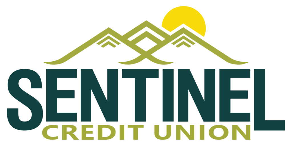
The Symbolism Behind Our New Logo
Our new logo is a testament to our rich history and our bright future. Here’s how it aligns with our brand strategy by encapsulating our values, aspirations, and unique positioning within the financial industry:
Heritage and Geography:
The incorporation of the Black Hills Mountain range pays homage to our geographical roots, grounding our brand in the local landscape. This connection to our region’s natural beauty reinforces our commitment to serving the community and reflects our longstanding presence in the area.
Experience and Culture:
The inclusion of the eagle, a symbol deeply entrenched in American culture, evokes a sense of tradition, honor, and trust. It resonates with our members, many of whom share a proud affiliation with the armed forces. By integrating this symbol, we reaffirm our respect for our nation’s heritage and our dedication to upholding the values that define our culture.
Aspiration and Innovation:
The upward arrows at the crest of the mountains signify our forward-looking approach and our relentless pursuit of progress. They reflect our commitment to innovation, growth, and staying ahead of the curve in an ever-evolving financial landscape. This symbolism communicates to our members that we are not only rooted in tradition but also poised for a future of continued success and prosperity.
Relationships and Trust:
The subtle incorporation of the bomber silhouette underscores our deep-seated relationship with the Air Force community. It serves as a testament to the trust and confidence placed in us by our members, including those who have served our country. This nod to our military connections reinforces our reputation as a reliable and trustworthy financial partner.
Vision and Leadership:
The radiant sun at the summit of the mountains represents our aspirational vision for the future. It symbolizes clarity, enlightenment, and the promise of a brighter tomorrow. By positioning ourselves as the guiding light in our members’ financial journeys, we reaffirm our commitment to leadership, innovation, and helping them achieve their goals.
Color Psychology
Our chosen colors are deep green, symbolizing trust, stability, and reliability; spring green, representing growth, renewal, and vitality; and vibrant yellow, exuding warmth, positivity, and optimism. Together, these colors form a harmonious palette that embodies our values and aspirations.
Conclusion
This brand refresh is not just about a new logo; it represents our commitment to evolving, innovating, and progressing to better serve our members and community. As we move forward, we invite you to join us on this journey-especially if you’re relocating, explore our resources for new movers-as we work together to build a brighter future for all.